Learn all about Divi Visual Builder, the Drag & Drop way to quickly and easily customize your Complete Website Kit.
- What is Visual Builder
- Building Blocks
Learn How To Customize Specific Modules in Divi
All About Visual Builder
What It Is:
The Visual Builder allows you to build your pages on the front-end of your website in real time.
When you add content or adjust design settings inside the visual builder, your changes appear instantly. You can click onto the page and just start typing. You can highlight text and adjust its font and style. You can add new content, build your page and watch everything happen right before your eyes.
How To Enable It:
While you are logged in to your WordPress dashboard, you can navigate to any page on the front-end of your website and click the “Enable Visual Builder” button in the WordPress admin bar to launch the visual builder.
If you are editing your page on the back-end, you can switch to the visual builder by clicking the “Enable Visual Builder” button that sits at the top of the back-end Divi Builder interface (note, you must first enable the Divi Builder before the visual builder button will appear).

Visual Builder Basics
The Building Blocks
Divi’s drag and drop page builder uses three main building blocks:
–Sections (the largest building block)
-Rows (nest inside the sections)
-Modules (housed within the rows)
Adding/Deleting/Copying Sections
Sections can be added by clicking the blue (+) button. When you hover over a section that already exists on the page, a blue (+) button will appear below it. When clicked, a new section will be added below the section you are currently hovered over.
If you are starting a brand new page, then your first section will be added automatically.

- To delete a section, hover over the blue section and click the trash icon.
- To copy a section, hover over the blue section click the two boxes stacked together.
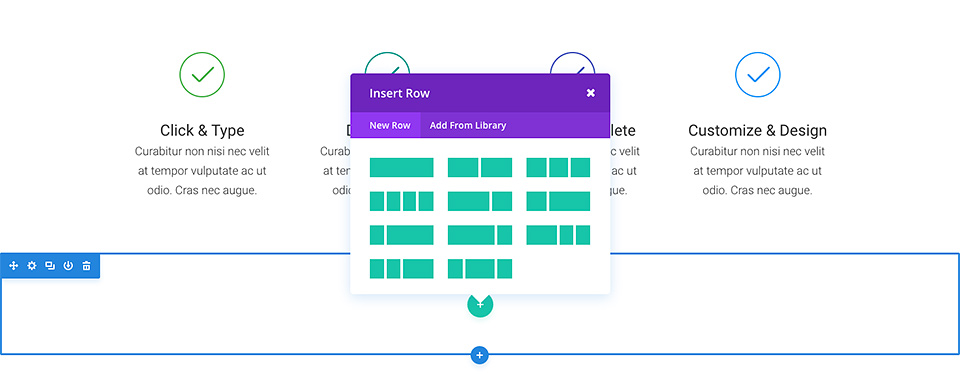
Add/Delete/Copy/Configure Rows
You can add a new section to add new rows, or you can add rows to existing sections.
Rows can be confiugured into columns so you can add multiple modules to one row.
A section can house any number of rows, and you can mix and match rows of varying column types to adjust existing page layout structures to match your business needs within your Complete Website Kit.
To add a row, click the green (+) button inside of any empty section, or click the green (+) button that appears when hovering over any current row to add a new row below it. Once you have clicked the green (+) button you will be greeted with a list of column types. Choose your desired column and then you are ready to add your first module.
- To delete a row, hover over the green row and click the trash icon.
- To copy a row, hover over the green row and click the two boxes stacked together.
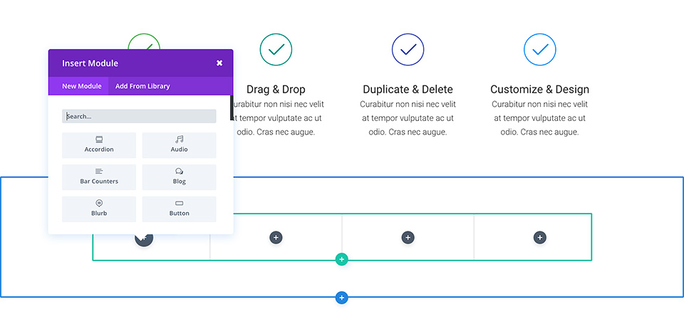
Add/Delete/Copy Modules
Modules can be added inside of rows, and each row can house any number of modules.
Modules are the content elements of your page, and Divi comes with over 40 different elements that you can use to build with. You can use basic modules such as Text, Images and Buttons, or more advanced modules like Sliders, Portfolio Galleries and eCommerce Shops.
Divi offers comprehensive tutorials for every Divi module, so if you want to learn more about the types of modules that Divi provides, click over to the ELegant Themes main document page and browse through the “Modules” section.
To add a new module, click the gray (+) button that exists inside of any empty column or click the gray (+) button that exists when hovering over a module on the page to add a new Module below it. Once you have clicked the button, a list of modules will pop up. Pick your desired module and it will be added to your page and the settings panel for the module will appear.
- To delete a module, hover over the grey module and click the trash icon.
- To copy a module, hover over the grey module click the two boxes stacked together.
Saving Your Work/Page Settings
To access general page settings, click the purple dock icon at the bottom of your screen. This will expand the settings bar and provide you with various options.
You will also find the Save and Publish buttons as well as mobile and tablet responsive preview windows.

Mobile Responsive Testing & Editing
Mobile Responsive Testing
To Test Mobile Responsiveness:
While in the visual builder of any page, hover over the grey docking station at the bottom of the page and click the icons to test Desktop, Tablet, and Mobile Views.
You can also change view to specific device while in the mobile tab.
To make select changes in Desktop View, Tablet View, or Mobile View separately, while in the module settings area, hover over the module title area for each heading until th Desktop/Tablet/Mobile options appear and make changes in each respective mode to set individual styles, colors, sizing, etc.
https://www.elegantthemes.com/blog/wp-content/uploads/2019/08/responsive-titles.mp4
Customize Modules
Learn how to use Divi Modules (like Text Boxes, Sliders, Image, Blog, Blurbs, etc) to easily customize your Complete Website Kit Pages or how to build new pages from scratch using these Basic Customization Divi Module Tutorials.
1- Changing Placeholder Text & Divider Color
1-1 Replacing Headings and Text with Your content
- Hover over each text module that you want to replace the text > click grey gear/setting icon > Content > replace the content with your text > click save
- Alternatively, you can click the text area you would like to change and start typing directly into the box > click save changes at bottom of page.
1-2 Resizing Placeholder Text
Most placeholder body text is set to the default font size of 16px. Some placeholder content is set to 18px to emphasize importance. If you would like to change these areas that are are not set to default, or to change any area you prefer to make larger:
- Hover over the text module you’d like to change > click grey settings icon > click Design Tab > text > text size > input your desired text size > click save.
- To change heading sizes, follow the steps above and scroll to > heading text to change sizing > click save.
1-3 Changing Divider Line Color
- To change divider line color, hover over the divider line > click settings icon > Design Tab > Line > Line Color > select your line color by inputting RGB color code > click save.
To view comprehensive documentation on the Divi Text Module, click here
2- Changing Placeholder Images
2-1 Changing Placeholder Images
- Hover over grey Image Module setting icon > click image > replace with your uploaded image or from your library > click save.
2-2 Changing Image Frame Color
- While still in the image module settings, click > design >scroll down to border > change border color to desired color
To view comprehensive documentation on Divi Image Module, click here
3- Blurb Modules
3-1 To Changing Out Placeholder Content
- Hover over the desired blurb box and > click grey blurb settings icon > Input your title > Input your content (be sure to keep the descriptions the same length to maintain equal box sizing) > image/icon to change the placeholder icon if you desire.
3-2 To Change The Link
- While still in the Blurb Module Settings, scroll down to link > Title Link > insert YOUR website link to YOUR services Page. Complete this step for each service link.
Ex: https://yourpage.com/services
To view comprehensive documentation on the Divi Blurb from Elegant Themes, click here.
4- Changing Background Colors
4-1 To Change the background of a Section
- Click the blue section settings > Content Tab > background > input your desired background color.
4-2 To Change the background of a Module
- Click the grey module settings > Content Tab > background > input your desired background color.
4-3 To change background color of a row
- Click the green row settings > Content Tab > background > input your desired background color.
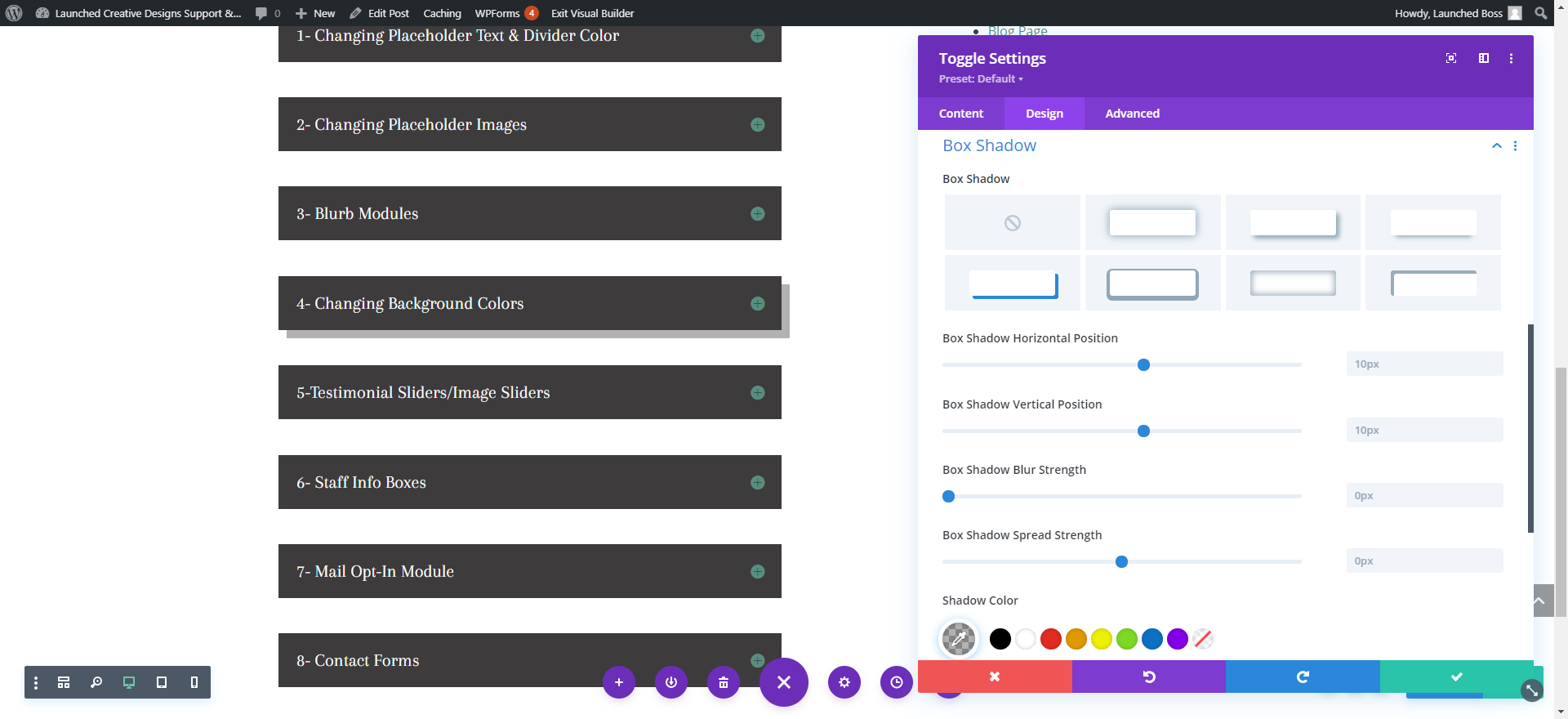
4-4 To change background color of a box shadow
Box shadows can be used to accent any module. To adjust box shadow of any module, click > Design Tab > Box Shadow > shadow color
5-Testimonial Sliders/Image Sliders
5-1 To Change Slider Settings
- Click Grey Slider Module Settings Icon > click grey icon for testimonial > click “text” to input your customer name and testimonial text
- To change background color of testimonial box: In main slider settings area (where all testiminials are listed) > Click Design > click Overlay > input your color > click save
- This will apply color changes to ALL testimonial sliders. To change each individual slider to a different color overlay or text settings, follow the directions above in each slide.
5-2 To add Additional Testimonials
- While still in the Slider settings module above > click the copy button on the slide above and follow the steps in 5-1 to change to your content.
5-3 To change image next to slider
- Click the image settings button > replace with your image
To view comprehensive documentation on Divi Slider Module, click here
6- Staff Info Boxes
6-1 To Change Staff Placeholder Images & Border
- Hover over grey Image Module setting icon > click image > replace with your uploaded image or from your library > click save.
- While still in the image module settings, click > design >scroll down to border > change border color to desired color
6-2 To Change Staff Title Box
- Background color of box: Click the grey module settings > Content Tab > background > input your desired background color.
- Border color of box: While still in the text module settings, click > design >scroll down to border > change border color to desired color
- Change placeholder text to desired text
- Change Text Styling: While still in Text module settings > Design > Text > change to desired color and size > scroll down to Heading text > click H1 > change to desired color and size > repeat for H2 styling
6-3 To change Detailed Info Toggle settings
- Hover over grey Toggle Module setting icon > Change Placeholder Title > Change Placeholder Body content
- Background Color: Scroll down to background > change to desired color
- Icon Color/Size (+): Click Design Tab > Icon > change to desired color and size
- Background Color (open): Toggle > Open toggle background (the color of the background when the toggle + icon is hit) > change to desired color
- Title Text (open): Click Title Text > Open title text color > change to desired color > change to desired font
- Title Text (closed): scroll down to Closed Title text > Open title text color > change to desired color and size > change to desired font
- Body Text: scroll down to body text > change to desired color, font, size
- Border: scroll down to border > change to desired color
7- Mail Opt-In Module
7-1 To Add Your Mailing List Credentials
- Click the “Email Optin” Module Settings > Scroll down to Email Account > Select your service provider from drop down list > Add your account name > add your account API (this will be found within your mailing list account) > click submit to load.
- Click “Success Actions” to set what you’d like your successful list opt-in to say
- To Change the background colors of the mail module: click the grey gear icon > content settings > background > color
- To change button style: Click “Design” tab and scroll to “button” to change button color and font
7-2 To Change the background colors of entire the section:
- Click the blue section settings > background > color
For comprehensive documentation on the Divi Email Optin Module, click here
8- Contact Forms
8-1 Changing Placeholder Content In Contact Form
- Hover over the contact form and click the grey settings icon > to change each field settings once in the Contact Form settings > click grey settings icon of desired field you’d like to change > change Title to desired title
- To change Services options > click services settings icon > field options > click in the box of the option you’d like to change and input your desired service title or click the delete button to remove > click the + button to add additional service
8-2 Email Address
- To input YOUR email address (the email address that all form submissions will be sent to), while still in the content form settings described above > scroll down to email > input YOUR email address
8-3 To change “success” message
- To change the message your site visitor receives upon successfully submitting the message form, while still in the form settings described above > click Text > success message > change to your desired success message. Click save
For comprehensive documentation on the Divi Contact Form Module, click here
10- Call To Action
10-1 Call To Action Styles
Hover over the Call To Action, click grey gear icon

- Click Title Text> change colors to desired colors > change font styles to desired fonts/size/colors > change
- Scroll down to “Body Text” to change Body text styles
- Click “button” to change button styles
- Click border width to increase or decrease button border size.
- Click border color to change color of border.
- Click border radius and increase size for more rounded border or decrease for more squared border.
- Click Box Shadow to add a shadow to box
10-2 To change Background color of module:
- Click “content” tab, scroll down to background > update background colot to desire background
Click green checkmark to save
To view comprehensive documentation on the Divi Call To Action Module, click here.
11- Toggle & Accordion Styles
11-1 Toggle Styles
Hover over the Toggle module settings gear icon to customize toggles
**Toggle Module is the same as the Accordion module, but the accordion module slides up and down when clicked vs. closing completely.**

- Click Icon > change color/size of toggle icon
- Click Toggle to change toggle background colors
- Click Title Text> change colors to desired colors for OPEN and CLOSED state > change font styles to desired fonts/size/colors > change
- Click Closed Title Text to set color for Title color when closed
- Scroll down to “Body Text” to change Body text styles
- Click border width to increase or decrease button border size.
- Click border color to change color of border.
- Click border radius and increase size for more rounded border or decrease for more squared border.
- Click Box Shadow to add a shadow to box
Click green checkmark to save
To view comprehensive documentation on the Divi Toggle Module, click here.
12- Blog Feed Styles
12-1 Blog Feed Styles
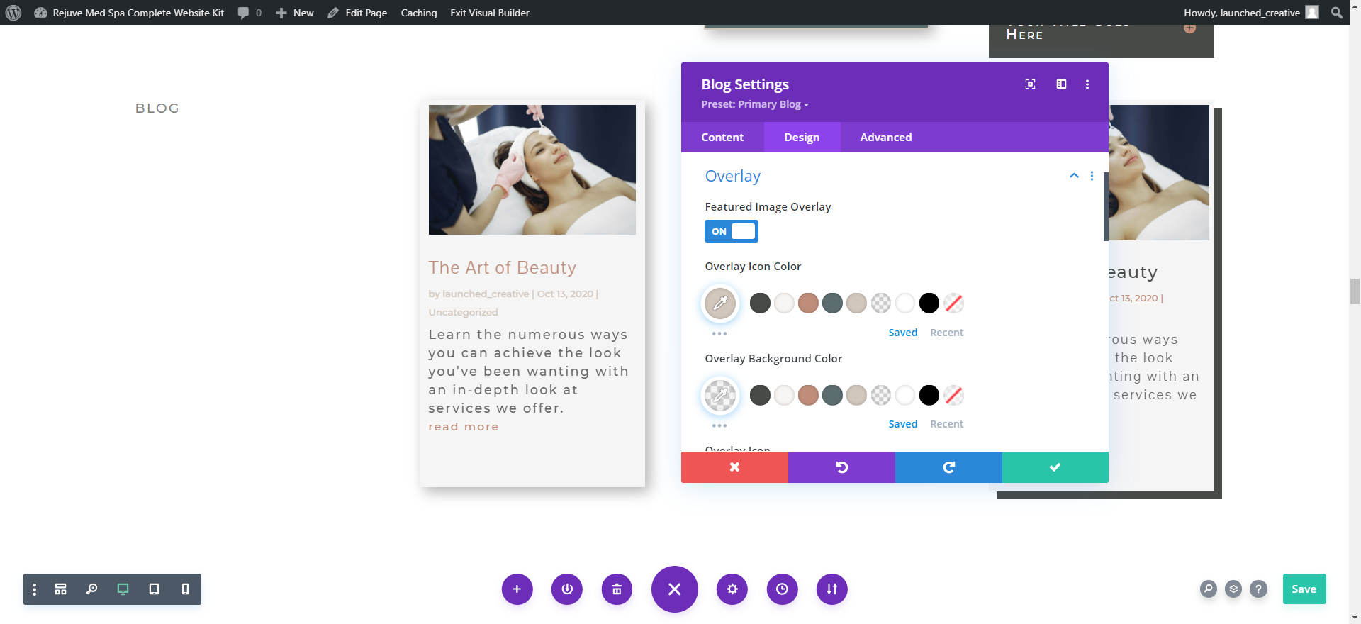
Hover over the Blog, click grey gear icon to open settings
- Click “Layout” to change fromfull width to grid
- Click “overlay” to change featured image overlay styles
- Click Image to change roundness of image and add border color and size
- Click Title Text> change colors to desired colors > change font styles to desired fonts/size/colors > change
- Scroll down to “Body Text” to change Body text styles
- Click “meta text” to change the meta text styles (meta text is the post info like date, category, author, etc)
- Click “Read More Text” to change the”read more” link styles
- Click “Pagination Text” to change styles for pagination”
- Click border width to increase or decrease button border size.
- Click border color to change color of border.
- Click border radius and increase size for more rounded border or decrease for more squared border.
- Click Box Shadow to add a shadow to box
12-2 To change Background color of module:
- Click “content” tab, scroll down to background > update background colot to desire background
Click green checkmark to save
To view comprehensive documentation on the Divi Blog Module, click here.